Pocket Prep is all new and your test anxiety doesn’t stand a chance. We’ve completely redesigned the app from the ground up to better facilitate mobile learning and cognitive retention. In other words, you can study smarter and not harder thanks to the science behind our exam prep apps. We’ve made it easy to keep the exam content fresh in your mind, no matter where life takes you.
Here’s a complete walkthrough of the new design so you can make the most out of your time spent with Pocket Prep.
Progress Dashboard
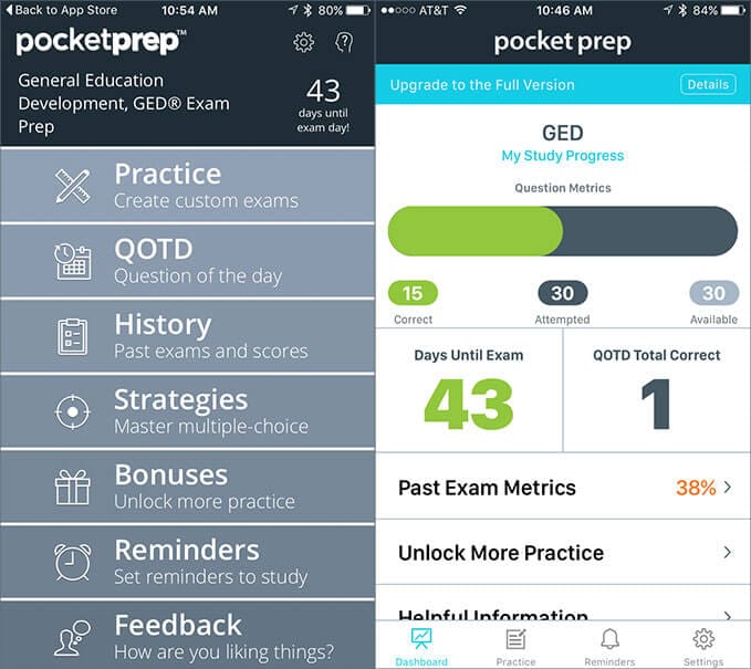
The Progress Dashboard (right) replaces the former home screen (left) and provides a much more visual overview of your progress through the test bank. The green bar indicates the total amount of questions you’ve answered correctly while the dark gray bar shows the total you’ve attempted. Because the app knows which questions you’ve already attempted, you’ll continue to get new questions in your exams until you’ve exhausted a particular topic or the test bank in general, which ever comes first.
We’ve added a cumulative QOTD metric, QOTD Total Correct, that serves as a running tally of how many daily questions you’ve gotten right. It’s also much easier to understand when the daily question is ready, as a large call to action will appear over top of your progress bar.
Unlock More Practice serves as way for non-premium customers to unlock more free practice, mostly through social media engagement. Once you upgrade to premium, all of these bonus questions are added to your test bank and this whole section disappears from the dashboard.
Helpful Information currently features our e-book, Cracking the Code: Mastering Your Multiple Choice Exams, which offers great tips and test-taking strategies. This is available to customers using both free and premium versions of the app. We plan to add more exam-specific information in a future update.
The Quick Launch Exam button is a brand new feature that allows you to start a quick 10 question quiz in a single tap. The quick exam defaults to show answers as I go mode, which makes it ideal for brief study sessions on the go. With the premium version of the app, this button provides a quick 10 question quiz based on your Exam Builder settings (more on Exam Builder later).
Tab Bar Navigation

Previously, the home screen was the main means of navigation. You had to return to the home screen in order to jump to the next section of the app. By creating a tab bar, we’ve simplified the navigation process. You can quickly jump between the dashboard and your past scores while still being only a tap away from starting a new practice exam.
Exam Builder
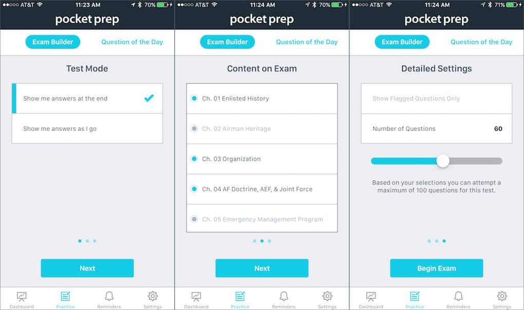
Under the Practice Tab, you can access Question of the Day and Exam Builder. Exam Builder replaces the former Exam Settings screen and guides you through the custom exam creation process. It’s worth mentioning that Exam Builder is only available in premium mode.
You start by telling the app how you want answer inputs to be handled; either show me the answers as I go or at the very end. Show me answers at the end better simulates the actual testing experience since you’re not getting feedback on your inputs until you submit the test for scoring. Show me answers as I go is what we previously referred to as “study mode,” since it’s ideal for learning new concepts. Regardless of the mode you choose, you’ll get a detailed breakdown of your performance upon completion.
Next, you’ll determine the Content on Exam. Everything is enabled by default, but simply tapping a topic will toggle it off and filter it out of your next exam. This is ideal for honing in on troublesome topics and getting the most out of your study sessions.
Lastly, you’ll select the Number of Questions and decide if the app should Show Flagged Questions Only. The minimum is 5 and the maximum is 100. If you’re using the app for the first time and do not have any flagged questions, this option will be grayed out. During practice sessions, you’re encouraged to flag items that may stump you, or ones that you’d want to revisit sooner rather than later. Once you’ve built up a mini-bank of flagged items you can create an exam consisting only of flagged questions, which is an awesome way to review items across multiple past exams.
Remember, your inputs from the previous screen will dictate which flagged questions are available, so enable all topics to attempt flags from all subjects.
Exam Screen
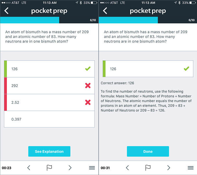
With its clean and minimal interface, the newly redesigned Exam Screen helps reduce distractions and places more emphasis on the app’s content. You can navigate the exam with the arrows below and through using what’s commonly referred to as the Hamburger Button, which brings up a list of all questions currently in that exam. Once you’ve attempted all the questions, the submit button will appear. Tapping the back button in the top-left corner will allow you to submit the exam early or simply discard the exam.
Question & Past Exam Metrics
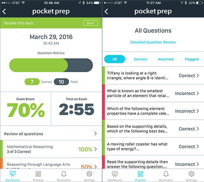
Once you’ve submitted your practice test, you’ll be taken to the Question Metrics screen. This is a readout of your performance and serves as a way to review the exam’s questions by subject. Tapping on either Review all questions or an individual subject will take you to the Detailed Question Review, where you can browse questions by Correct, Incorrect, or Flagged status. Tapping on any particular question allows you to review your answer inputs, read the answer explanation, and toggle question flags as needed.
Due to popular request, we’ve implemented Retake this test which allows you to retake any previous exam with a single tap. You’ll get the exact same questions as before so you can work on increasing the amount of correct questions shown in My Study Progress within the Progress Dashboard. It’s important to note that the app treats a retake as a new exam, so it will log a new entry under Past Exam Metrics.
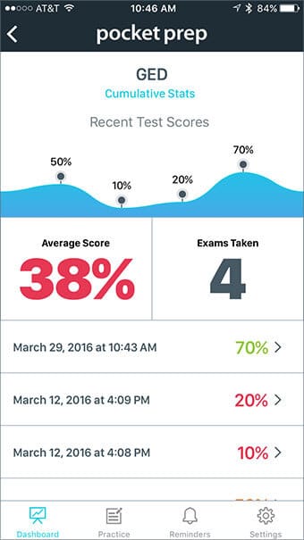
You can return to any of your past exam results through the Progress Dashboard by tapping the Past Exam Metrics header. The app tracks all of your exams and reports cumulative progress through the PEM screen shown below. PEM serves as a quick and easy way to visualize your past performance as it plots the scores of your five most recent exams.
Reminders
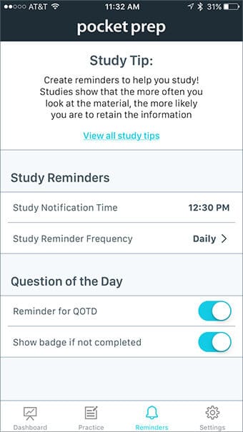
One of the best ways to keep the exam content fresh in your mind is through the Reminders portion of the app. Tell the app when you want to study and you’ll get a push notification directly to your device. You can even set a frequency of Daily, Weekly, or Monthly.
Question of the Day becomes available at midnight each night, and you can choose if and when the app reminds you to attempt it. Show badge if not completed puts a red badge on the app icon from your device’s home screen when QOTD is available, which serves as a visual notification and can help cut down on the amount of push notifications you receive.
Remember, you must accept notifications when prompted by the app in order for reminders to work properly.
Settings
Here you can use the Scheduled Exam Date field tell the app when you plan to take your exam, which affects the countdown in the Progress Dashboard. From time to time, we’ll push new content to the app which is automatically fetched when the app initializes. You can be sure you’re using the latest content by tapping the Update Content button. Last but not least, you can visit our Support Center for helpful articles and answers to frequently asked questions.
A Note from our CEO on Cloud Integration
In addition to the long list of updates and enhancements mentioned above, we intended to deploy cloud functionality across our suite of apps. These cloud features would have allowed our customers the option of creating an account that synced all of their history and progress seamlessly across multiple devices and platforms. Switching between an Android phone and an iPad would have been as simple as logging in with your new Pocket Prep credentials.
We spent a large portion of this six-month project developing with Facebook’s backend as a service (BaaS) known as Parse. In late January, developers around the world learned of Facebook’s intentions to shut Parse down by January 2017. Despite an entire year of service remaining, we decided not to launch this new version hinging on an integration with an expiration date. It would have been too difficult to predict Parse’s performance over the next several months and the risk simply wasn’t worth the reward.
An unreliable cloud poses a threat to the app’s overall reliability, and we want to make sure you’re able to use our apps with absolutely no interruption to your studies. While we’re more than a little disappointed with circumstances outside of our control, we know we made the right call postponing cloud integration. We appreciate your understanding and support as we continue to build an app you can count on.

